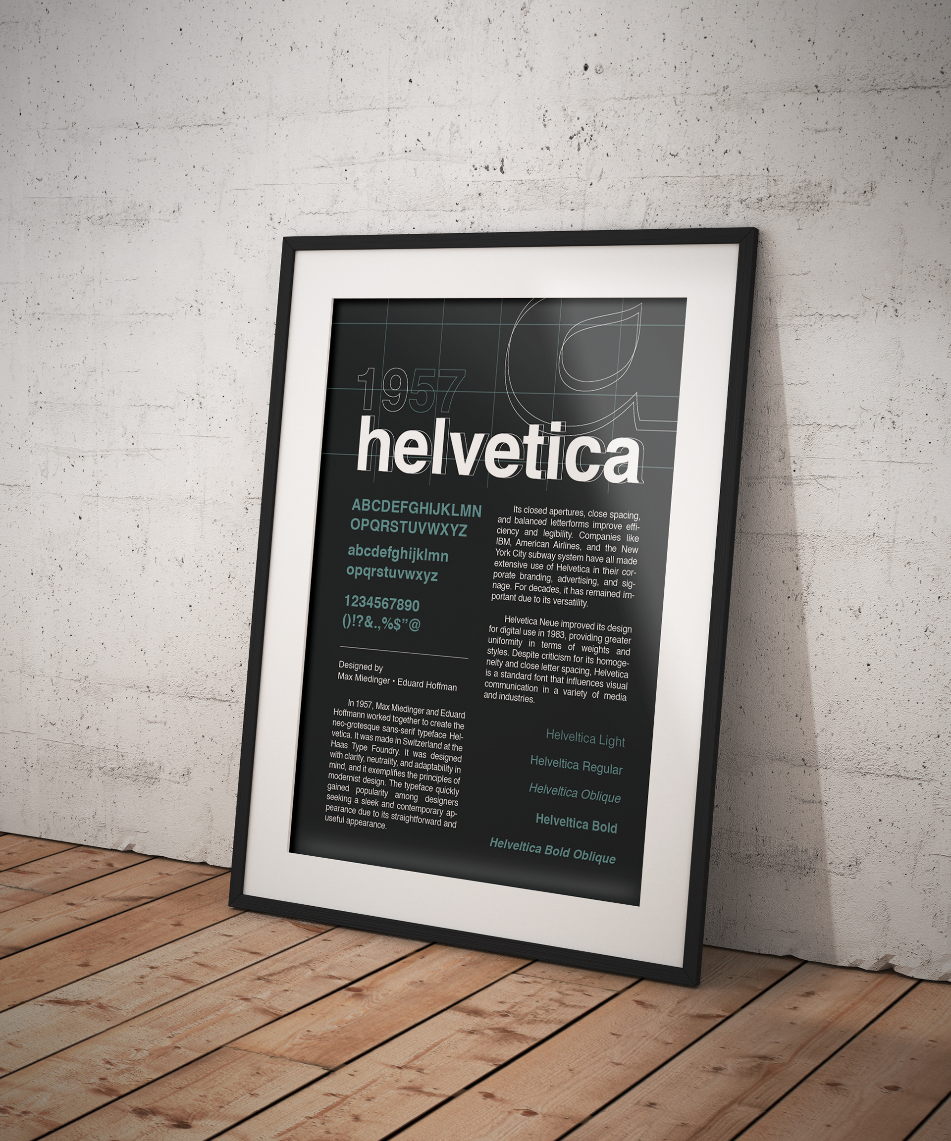
Broadside Poster: Helvetica
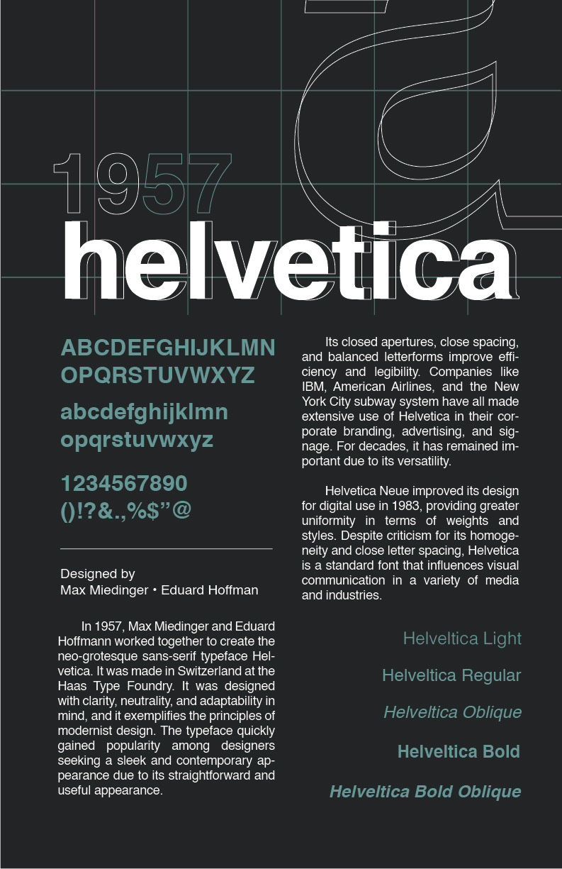
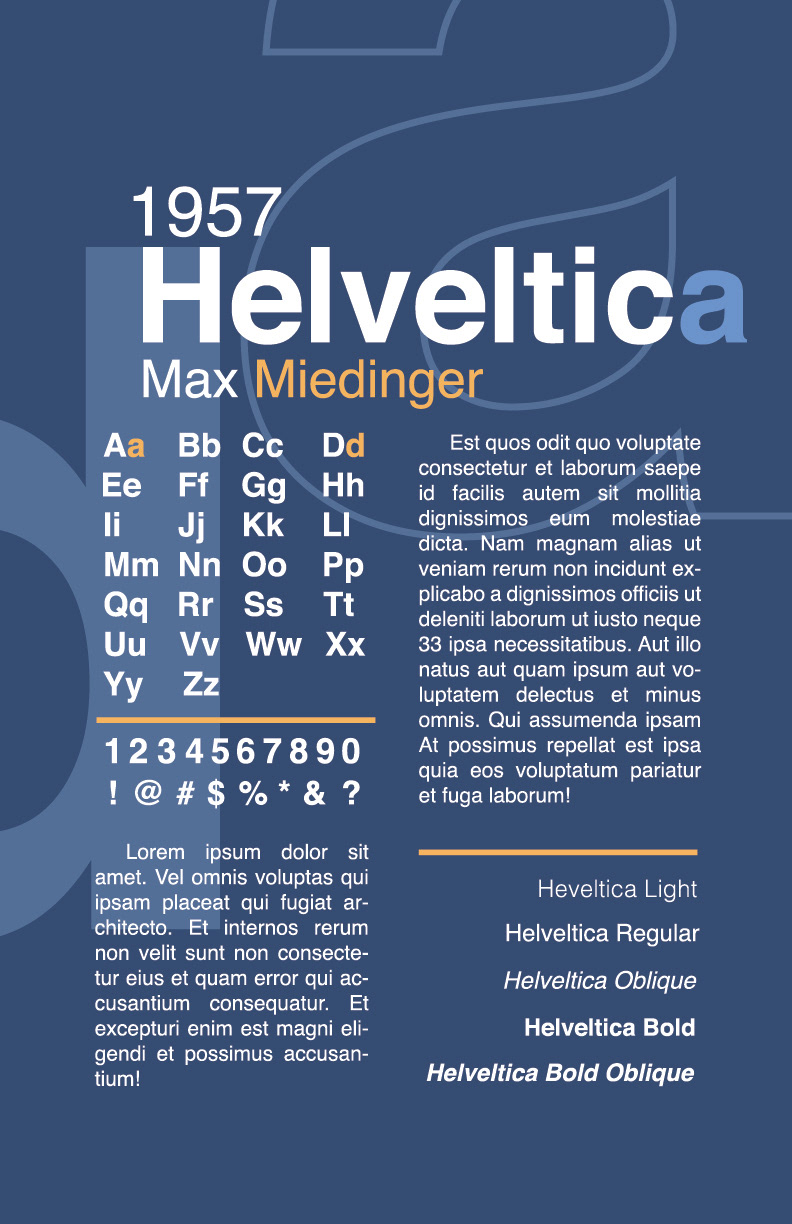
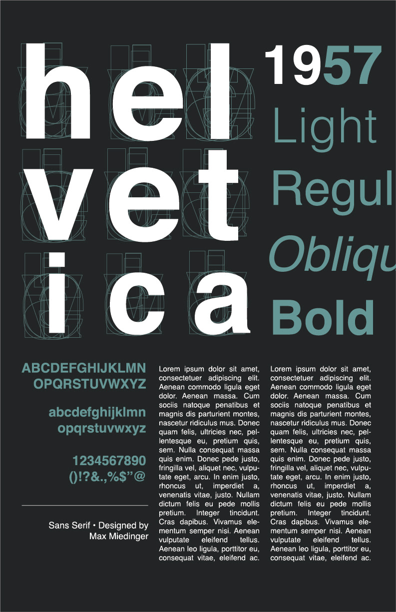
Helvetica feels modern, clean, and easy to read. The typeface is used everywhere, from branding to signs, and its simple design makes it reliable in almost any setting. A clear example is the New York City subway system (MTA), which uses Helvetica because it stays readable and consistent. Overall, the typeface fits the look I wanted and represents a straightforward, modern style.
VERSION 01
VERSION 02
MOCKUPS