Animated with Adobe After Effects
Case Study: Personal Logo Design
For my initial logo design, I wanted to create something that represents playful, creative, and full of energy spirit. The idea was to design a mark that feels personal but still professional, reflecting both my artistic side and growth in digital design. I wanted it to stand out while staying simple enough to be memorable, combining colors and typefaces that feel true to my personality.
stage one:
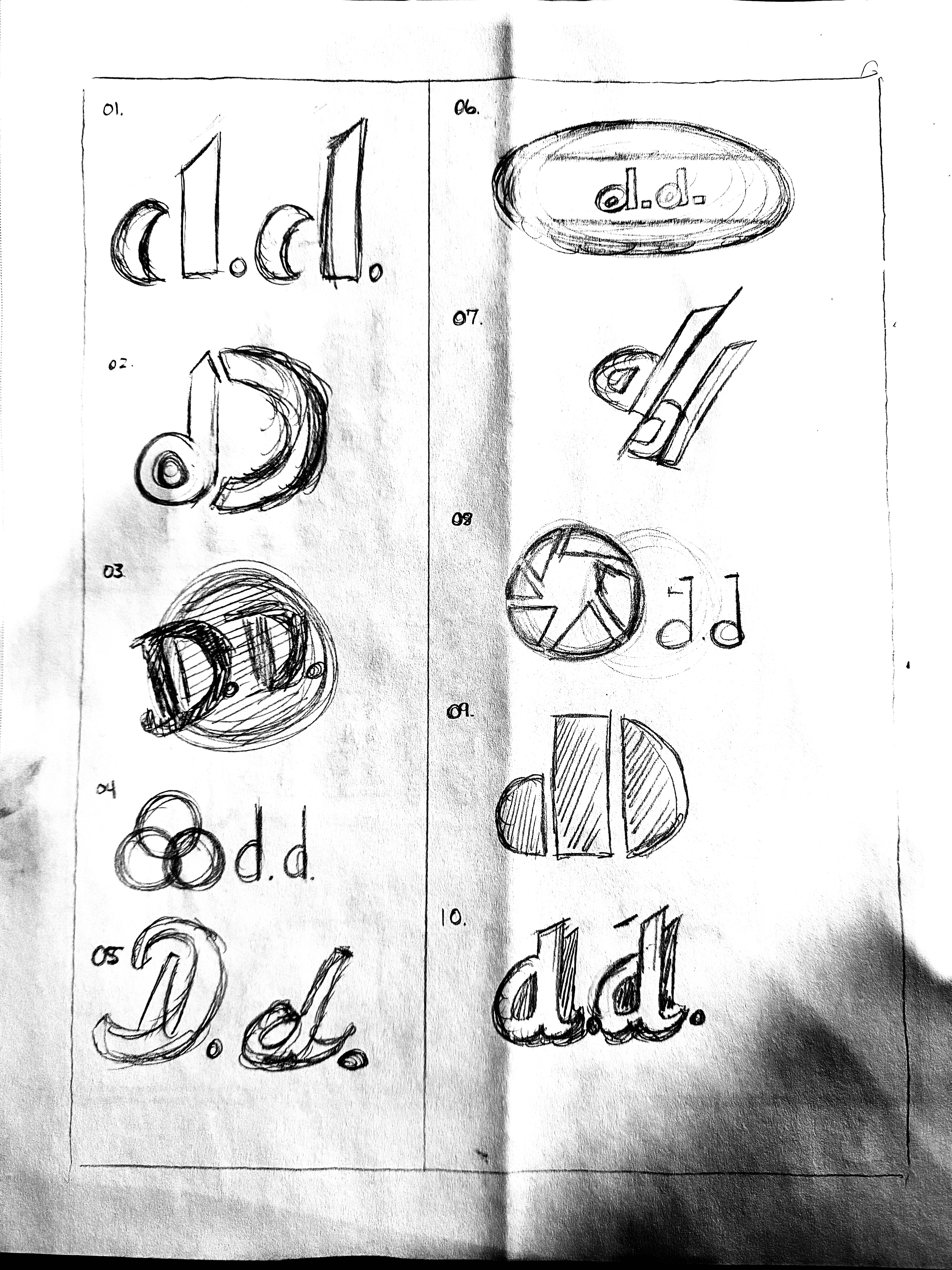
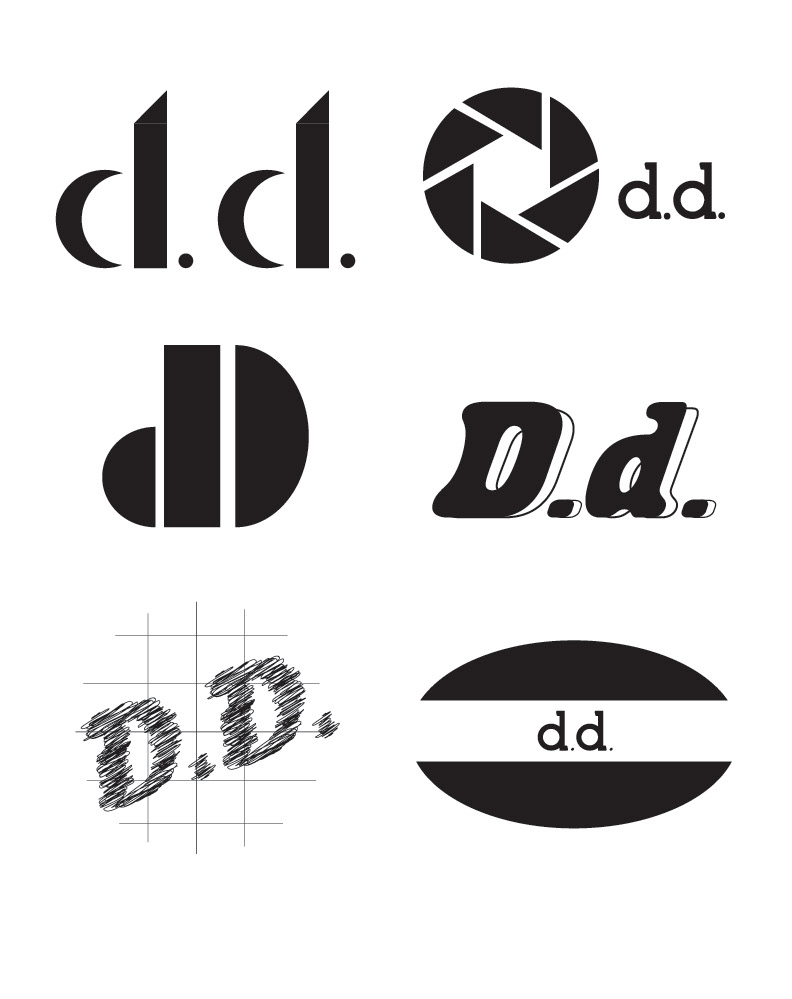
I began with 10 rough sketches to explore different ideas and directions. From those, I chose 6 that I turned into vector art to see how they would look digitally.
STAGE TWO:
Even though I liked some of them, I wanted to design more various logos, so I started creating new versions from scratch. This time, I focused on shapes and letterforms that felt more authentic to me.
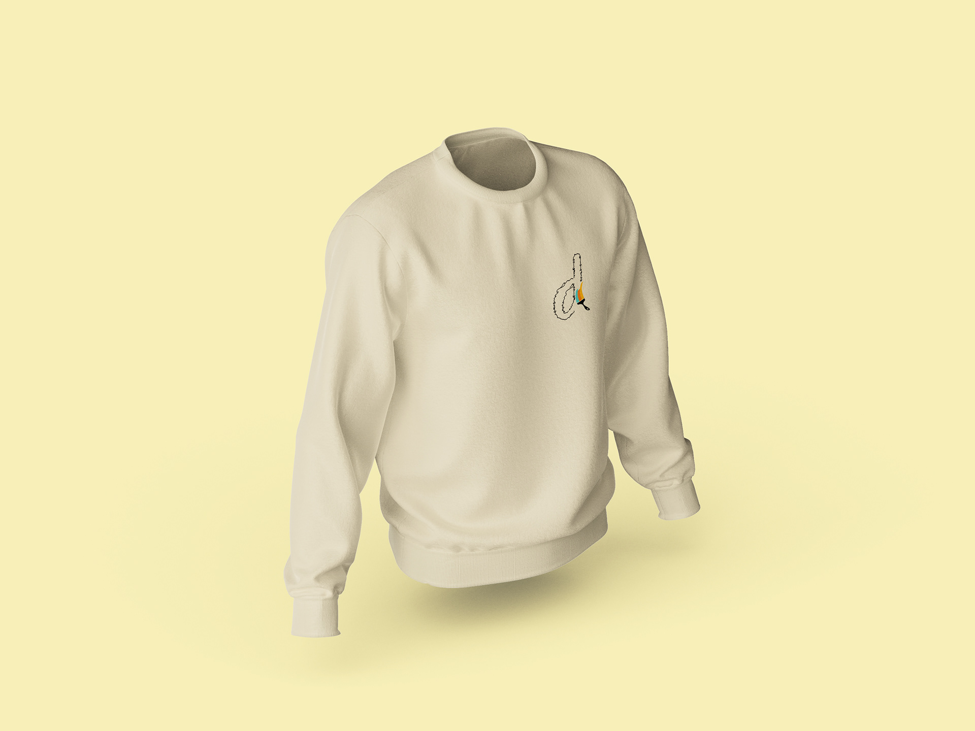
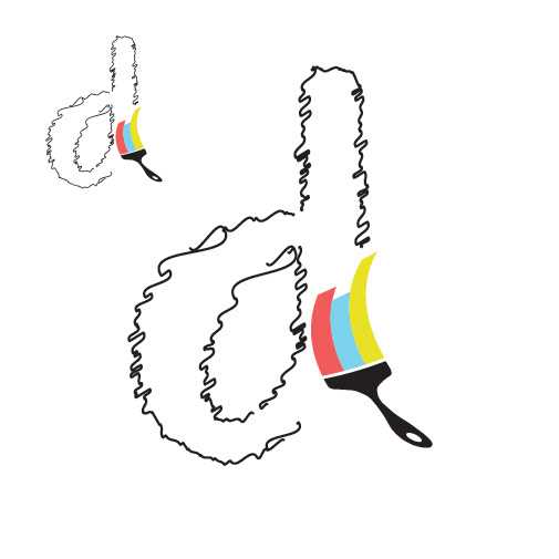
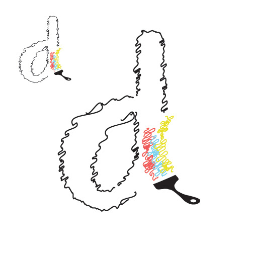
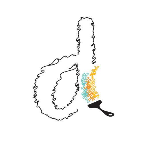
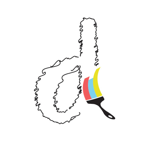
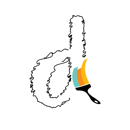
During this stage, I also made my own custom brush design and added it onto the lowercase “d,” giving the mark a more unique and personal touch.
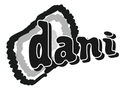
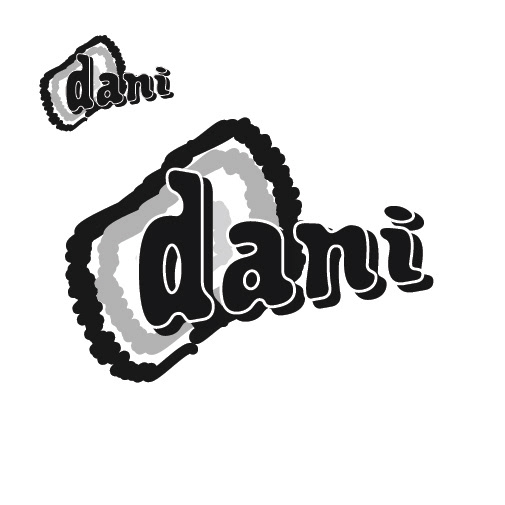
FIRST DESIGNS: lowercase "d"


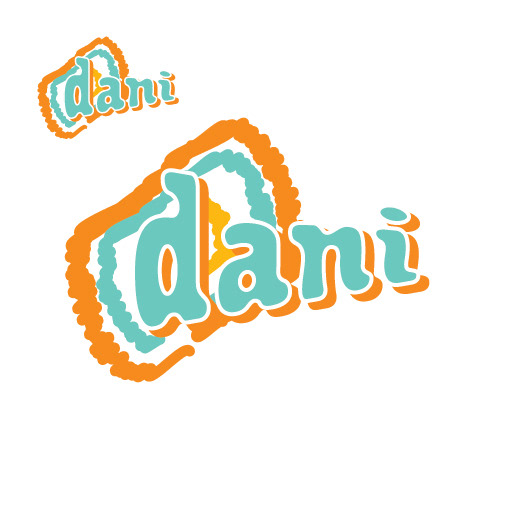
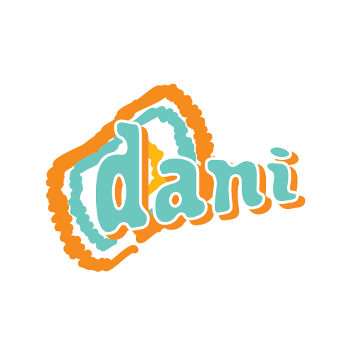
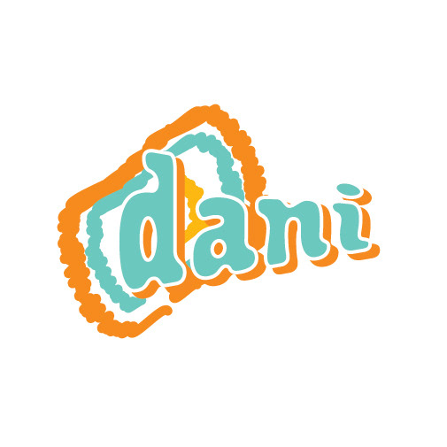
SECOND DESIGN: "dani" with splash background.
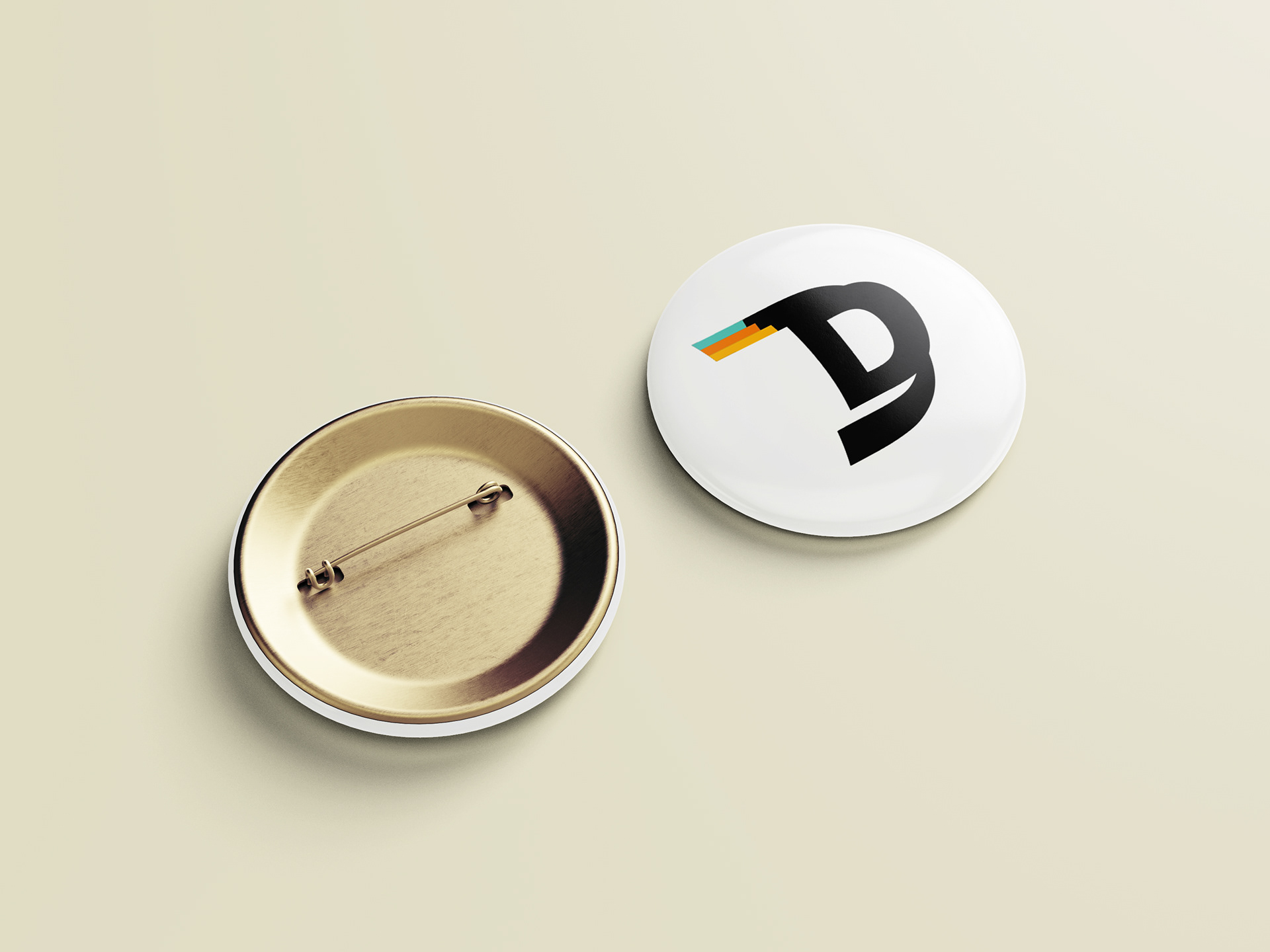
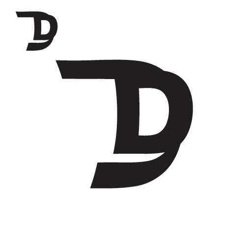
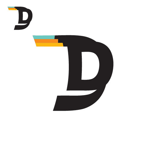
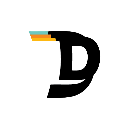
THIRD DESIGN: Capital "D"
STAGE THREE:
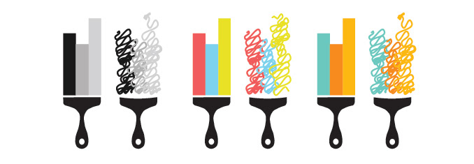
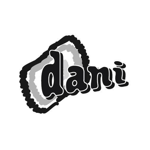
I narrowed it down to 3 designs that finally felt right and reflected my personality. From there, I refined the details, played with typefaces, and experimented with orange and green tones that I personally enjoy.
and... finally:
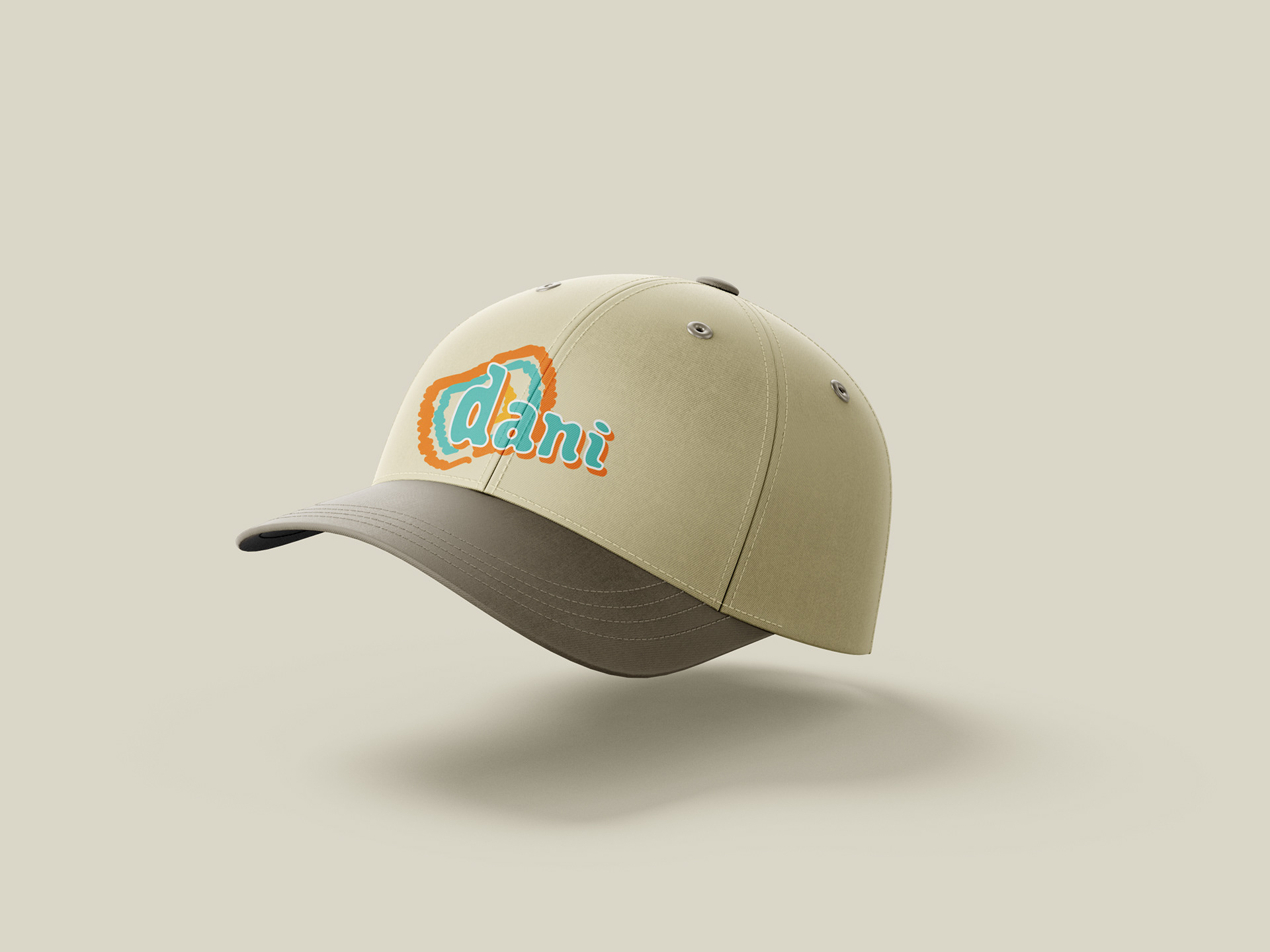
I ultimately decided on the version that reads "dani" with the splash background because it felt perfect right away.
Final Version 01
Final Version 02
MOCKUPS